Designer Appreciation: Finding Inspiration in the Work of Raymond Loewy
Mid-century modern is an umbrella term that describes the popular industrial design taste ranging from the mid-1940's to the mid-1970's across all disciplines—architecture, interior design, product design, and graphic design. It was huge shift in its time, orbiting around the desire to strip away excessive ornamentation and get things down to their most basic shape elements. Despite the changing aesthetics of the 1970's onward, it continues to endure—in the words gallery owner Patrick Parrish, “It’s been the new cool thing five times in the last 50 years.”
Of course, no design era is the pinnacle of perfection. Elements of mid-century interior design can oversaturate our eyeballs—does anyone else completely overlook the Eames chairs placed in the corner of perfectly-styled rooms on Pinterest—and after living in post-Soviet East Germany for a year, I gotta say that the stark minimalism of Brutalist architecture can get really depressing in a snowless winter. (I also have to admit that sometimes even the word “design” is so overused that it feels like a gnat swarm to the face on a muggy day in August.)
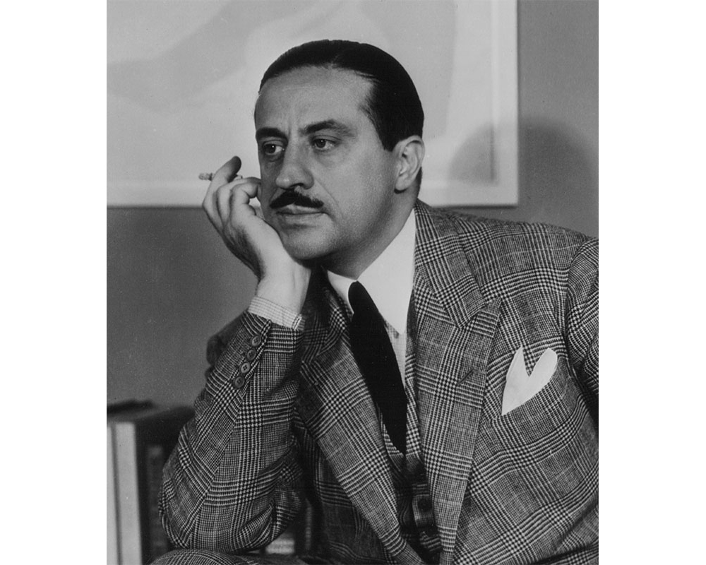
Yet, I can't help but love the work of French-born, NYC-based designer Raymond Loewy (1893–1986). You probably don't know the name, but the guy was so prolific that unless you've been living in a cave, I guarantee you've seen his work. Let's take a look at some of his greatest hits.
Five iconic pieces by Raymond Loewy
Out of several hundred examples, I've chosen five of my favorites based on their visual relevance in the present. Some of them still do have that “retro” feel and some of them feel like they could have been designed this month, but none of them would look out of place in our homes or cities.
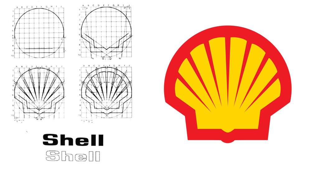
1. Shell logo (1971)
Yep, Mr. Loewy was the man responsible for stylizing a photorealistic rendering of a shell into a brand mark so recognizable that it doesn't even need the company name. This is the mid-century shape game at its finest: take away any of these elements—the 7 radiating lines, the semicircle, the trapezoidal base, the parabola dip at the bottom—and it doesn't read like a shell.
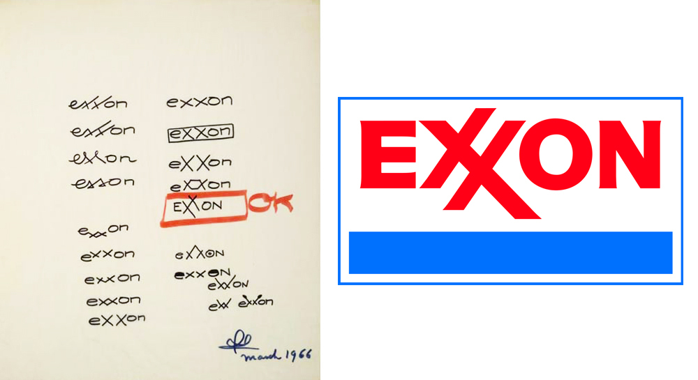
2. Exxon logo (1966)
This is a pretty straightforward logo, but one thing I noticed about it when I scrutinized it is the space-saving device of the crossed X's, which not only makes it more compact but also creates a dynamic and memorable shape.

3. Air Force One livery (1962)
This is another design that has remained unchanged for over 50 years. The two shades of blue and gold are a perfect balance of lighthearted and dignified, and the choice of the Caslon typeface (slightly tracked out, i.e. with greater space between the letters) recalls the typeface used on the Declaration of Independence. Plus, come on, man—that parabolic swoop on the front, echoing the graceful flow of wings in flight, is totally sweet.

4. International Harvester Farm-All tractor (1939)
This is my all-time favorite Loewy design. He transformed what was once basically just a big box with an engine and four wheels into a piece that belongs in an art museum. The curved corners are gentle, the front grille is broken up into four sets of four slits to provide subtle rhythm, and the sideways L-shape of the motor housing optically balances the two large back wheels when you view the tractor in profile. (Plus, that bright red set against the backdrop of a green field is, to quote Ferriss Beuller, so choice.)


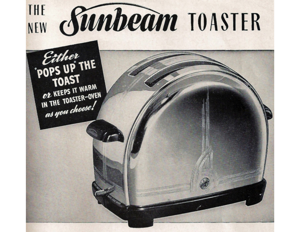
5. Sunbeam T9 toaster (1939)
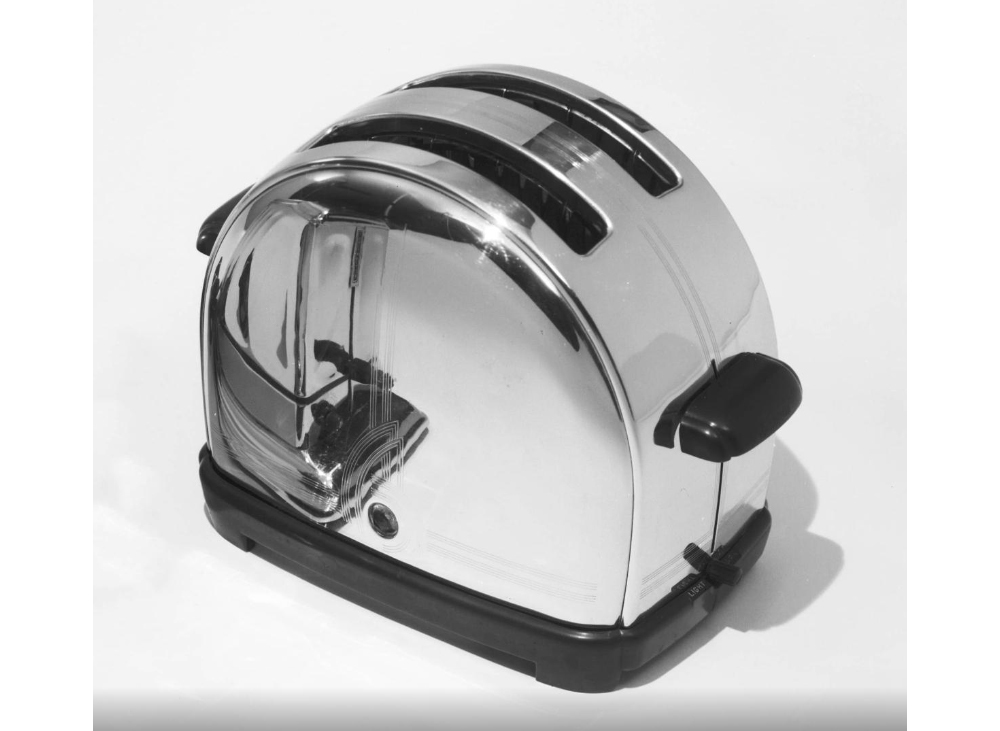
This is decidedly the most “retro” of the objects in my list, but I couldn't help including it because there's something so pleasing about a toaster made of half an ellipse instead of a rectangle. It would be nice to have one of the first appliances you're likely to meet in the morning have such a peppy presence.
…but wait, there's more!
Plug in “Raymond Loewy” into Pinterest and you'll find an overwhelming amount of his other designs in logos and other branding elements, products, cars, and trains.
Further reading:
His 1950 autobiography Never Leave Well Enough Alone, republished in 2002 by Johns Hopkins University Press, is out of print but looks fantastic. I really like that they included an egg on the cover and this quote on the back—”The perfect functional shape: the egg. . . . It is a marvel of design”—because I've long appreciated ovoid shapes with one axis of symmetry as a visual design element.

